
Away from what fruit has always been,
towards what fruit can really be.
Challenge
Tradition meets modern.
When one thinks of a fruit brandy, rustic atmosphere and a convivial round with people of an older age come to mind. But nowadays a fruit brandy can do more than that. Through different fruits, new processes and storage in barrels, exciting new products are created that allow a lot to be discovered aromatically.
In close cooperation with the family business Destille Kaltenthaler, we were given the task of revising this very outdated image of fruit brandies, and the wish was expressed to show what special craftsmanship lies behind the distilled fruit. The challenge was to develop a new product line that repackages the very dusty image of fruit brandies and translates it into a modern language, but still unites the creative process of the distillery and the decades of expertise.

Our distilling client
FELIX GEORG KALTENTHALER

Growing up on a vineyard, our distiller learned to love his craft from an early age. With this imprint, the first brandies were created long before he was 18 years old. He is now the third generation to run the family business, building on the success story. The distillery has already been awarded the State Prize of Honour in the past.

Primary product
The closeness to the primary product and the understanding of its cultivation are what make everything at Kernstein. Thus, industrial pure yeast is categorically avoided and instead what nature produces is used. Following the example of natural wines, spontaneous fermentations are promoted for the benefit of the characteristic terroir. With this relationship to schnapps, you can taste nature unadulterated in every bottle.
Credo
In cooperation with fruit growers who pursue their craft with true passion and dedication, special and selected fruit varieties are sought out year after year. Because just as each year tells its own special story, each vintage also has its own unmistakable character. The aim is to draw this character onto the bottle in order to make its history tangible. In order to do justice to this claim, only single-variety primary products are used, which are harvested when fully ripe, sorted by hand and cleaned.
Once in the distillery, all previous standards are scrutinised, from fermentation, distillation and storage to drinking strength, to see if individual steps can be implemented differently, or perhaps even better.
Away from what fruit has always been, towards what fruit can really be.

Implementation
We therefore set ourselves the task of creating a corporate design that visually picks up on the actual core of schnapps production. Implemented with a design language that sets a completely new tone in the dusty genre of fruit brandies and shows that fruit with a dash of alcohol is not a boring and rustic affair, but that fruit brandy can once again be part of a cool drinking culture that inspires generations.
What was done:
Idea & Concept | Type Design | Graphic Design | Product Design

True to our motto, we break all previous constants and lay the foundation stone where everything really begins: out in the field. Uncompromisingly honest – starting with the cultivation of the fruit varieties, followed by the fermentation of the mash and ending with distilling in the distillery. Kernstein is not a simple fruit brandy, Kernstein is awesome schnapps.
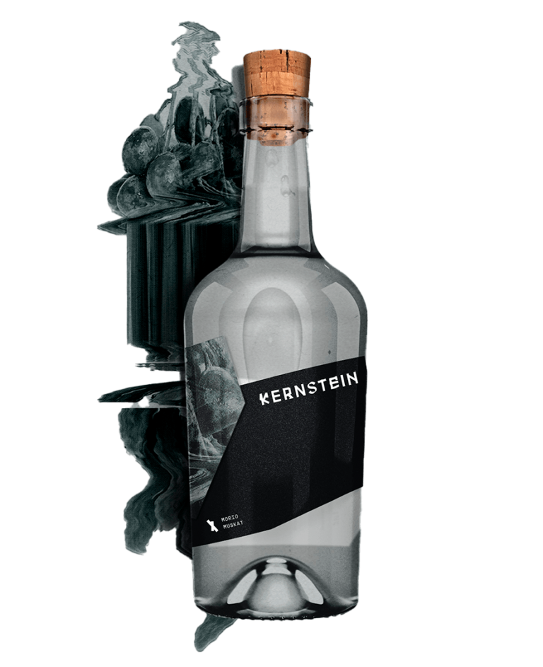
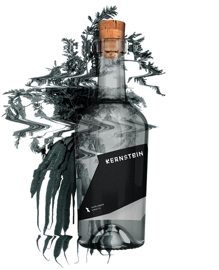
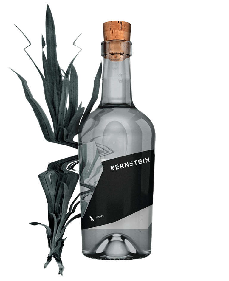
The branding for Kernstein should be just as unique as nature produces its fruits and the distiller wants to draw that character onto the bottle. The name is derived from the primary products pome (Kernobst) and stone fruit (Steinobst). A combination of the two german words Kern and Stein. Kernstein. So simple.
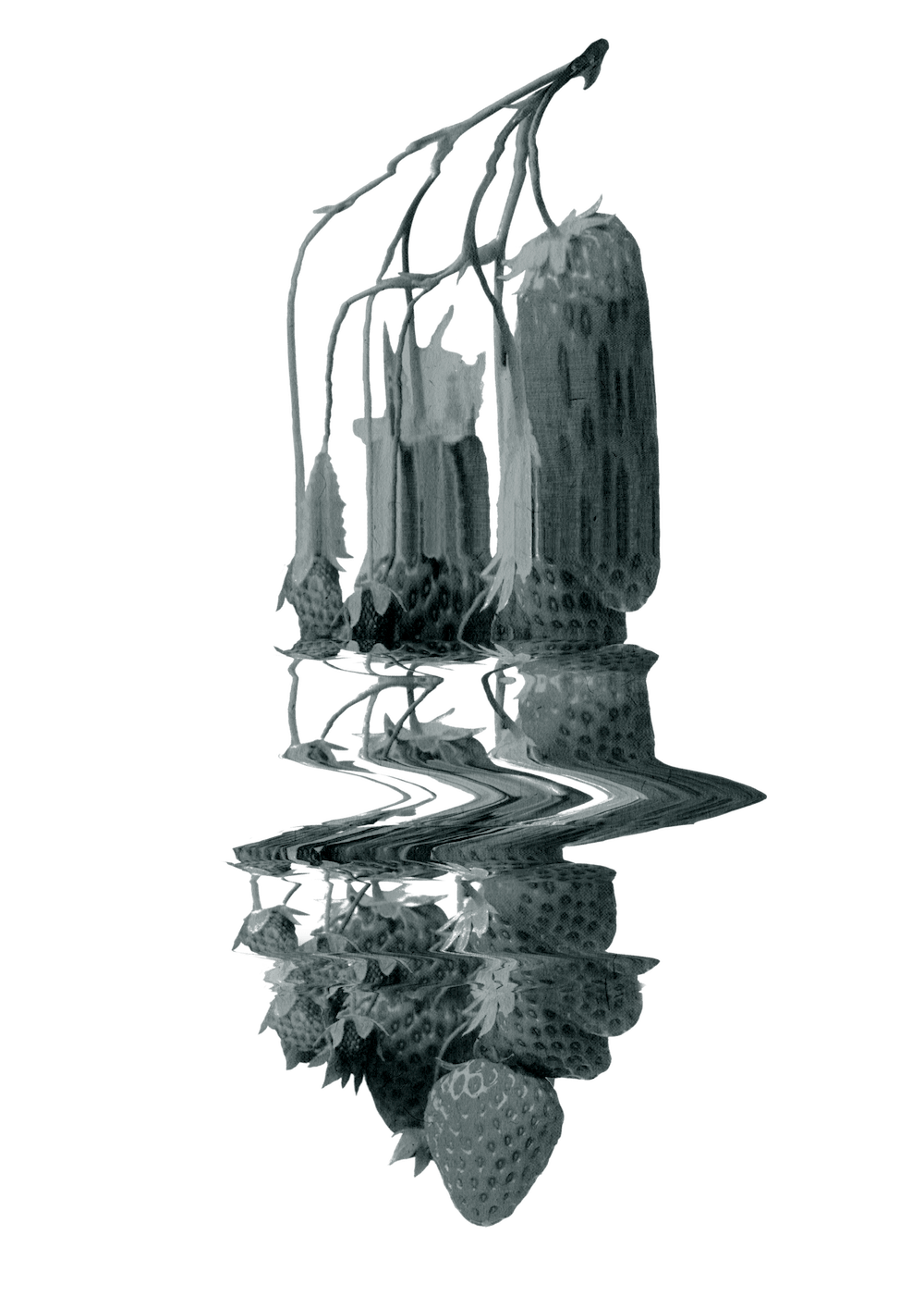
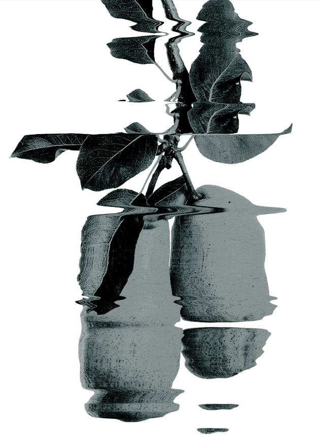
The primary products are destroyed by pitting and stoning before mashing and distilling. This is the only way to bring out the full flavour of the primary products in the brandies. The creative guiding idea “Destroy to Create” is derived precisely from this creative process of the distiller and runs completely through the visual creation of the Kernstein brand for a consistent appearance. It lets the customer see the special craftsmanship a more abstract and subtle way. A visual change of perspective on the subject of fruit brandies. The core or stone of a good story, retold in the third generation.
DESTROY TO CREATE
Typography
Inspired by the central idea, an independent corporate typeface was constructed especially for the Kernstein brand in order to create a strong recognition already in the typography. The developed letter set of Kernstein consists of three different font classes: Fraktur, Grotesk and a deconstructed Sans Serif. Each type class follows a characteristic of Kernstein. The schnapps as a German product in connection with a German Fraktur typeface, a simple Grotesk for the modern art of distilling and a completely deconstructed typeface representing the breaking up of previous constants in the product development of fruit brandies. A combination of characteristics in one typeface, unusual and special.
Colours
Kernstein's colour scheme is kept very simple and muted. The primary corporate colour is the defined Kernstein Mint hue, representing the fruit water, of the distillate, which is distilled from the unadulterated natural mash. It is a shade between a dull grey and green and contrasts well with the secondary corporate colours of black and white, but without being obtrusive or loud. Other colours are deliberately omitted so that the branding is foregrounded by its key visuals.